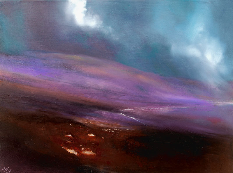
The Mountain Road ©John O’Grady 2014
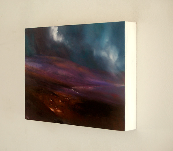
Oil on deep edged Beech Panel, 18 cm x 24.2 cm x 3.7cm deep
(approx. 7″ x 9.5″, no need to frame and ready to hang)
SOLD
High up in the mountains of Wicklow, the narrow roads that rise and cross the mountains draw a fine line across the wild and bleak landscape. Surrounded by blanket bog, they twist and turn till they disappear over the horizon of a distant mountain.
On wet and wintery days, you mightn’t pass another car till you reach the other side of the mountains.
A major crossing point is at the Sally Gap, a crossroad I painted last year. It’s a very open space with amazing views all around that witness through colour and light the changing patterns each weather front, each time of day, each season bring.
The palette in this painting is richer than the first “Sally Gap” painting. The Violet colour gives it an autumnal feel.
Talking of palette, I had someone ask me about the oil colours that I use and what make they are.
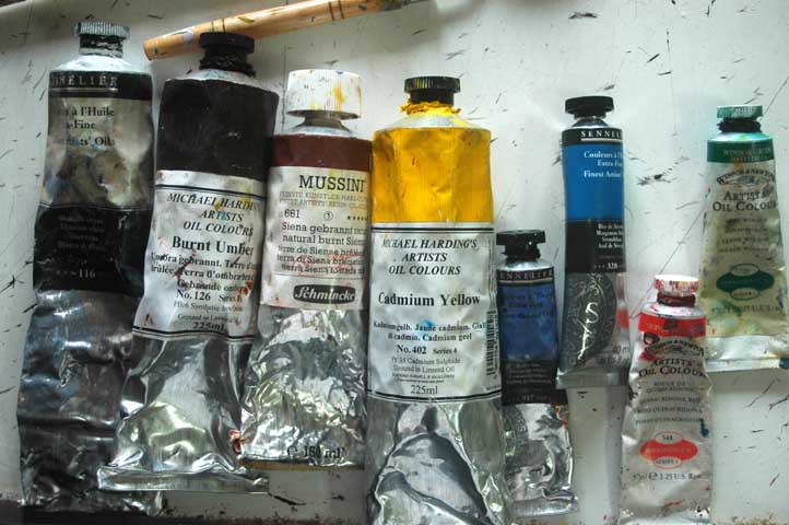
So for this painting I used:
I suggest you click on the image to see more detail.
From left to right they are:
Sennelier Titanium White – This has the right consistency for me: buttery but just dense enough for covering and building highlights. I also use a Blockx Titanium white which is really dense for when I want a white to really stand out.
Michael Harding Burnt Umber – I have heard so much about these paints which are highly reputed but although I’ve found this earth colour rich, it’s no richer than others I have used.
Schminke Mussini, Burnt Sienna – I have great fondness for this colour and its rich qualities when mixed with reds. This is again a highly reputed paint and it’s good but I have used a Daler Rowney one in the past that was richer.
Michael Harding, Cadmium Yellow – A highly pigmented mid range (not warm or cool) yellow that is expensive and one I had to think twice about buying as it costs about 80 Euro but as you only need a very small amount, it really does go a long way. A good buy.
Senellier Permanent Violet – I like this paint and wouldn’t be without it. I have only ever used this one type of Violet. It makes the most gorgeous night blues and it’s great mixed with burnt sienna to get rich earthy colours.
Sennelier Manganese Blue – Like the previous colour, I wouldn’t be without this either. A great greenish blue for skies and mixing with violet for night blues. I have only ever used the Sennelier Mang Blue, it’s great.
Windsor and Newton Quinacridone Red – Bought as a replacement for alizarin crimson, it acts in a very different, good, way that makes the most delightful pinks and oranges.
Windsor and Newton Monestial Green – This paint really packs a punch and you only need the smallest amount. It’s great mixed with cadmium yellow for vibrant greens.
You have probably noticed that they are different makes. My experience is that each manufacturer makes paints that are stronger and weaker depending on the colours and properties. It’s fun to try different ones and see how they behave.
I’d love to hear what you think.


Another wonderful landscape John. The colours do indeed have an autumnal feel and are very effective in evoking the wild earthy bog and surrounding hills. What strikes me is the smooth sloping sweep of the hill which add to a sense of mystery often sensed in your paintings. The diagonal of the highlighted pathway contrasts with this really well.
On a different topic – I was intrigued once again by the vocabulary used to describe the colour of some of your paints such as Quinacridone and Monestial!
Hello Christine,
It is another world the naming of paints, some of them have delightful names, the Quinacridone is a modern replacement for Alizarin Crimson an old paint that is supposed to have fugitive qualities, although I have never seen evidence of this. Thank you for your comment on the painting, the sweep of the hill which moves in and out of light and dark is the strong point of the piece I think.
Hi,
I followed you here from google+. I’m not an artist (if you call drawing biology diagrams an art), and frankly do not know a thing about colors or palettes. But I judge (if I may use the word) a work on it’s beauty, and your works are beautiful. You create a beautiful impression of the nature, and I enjoy them. And as my art vocabulary, which is not much to begin with, is drawing to an end, I hope that you keep on capturing more wonderful landscapes…
Hello Maniksha,
Thank you for looking at my painting and visiting my blog. Your words are most kind. I would like to invite you to subscribe to my blog https://www.johnogradypaintings.com/blog. kind regards John