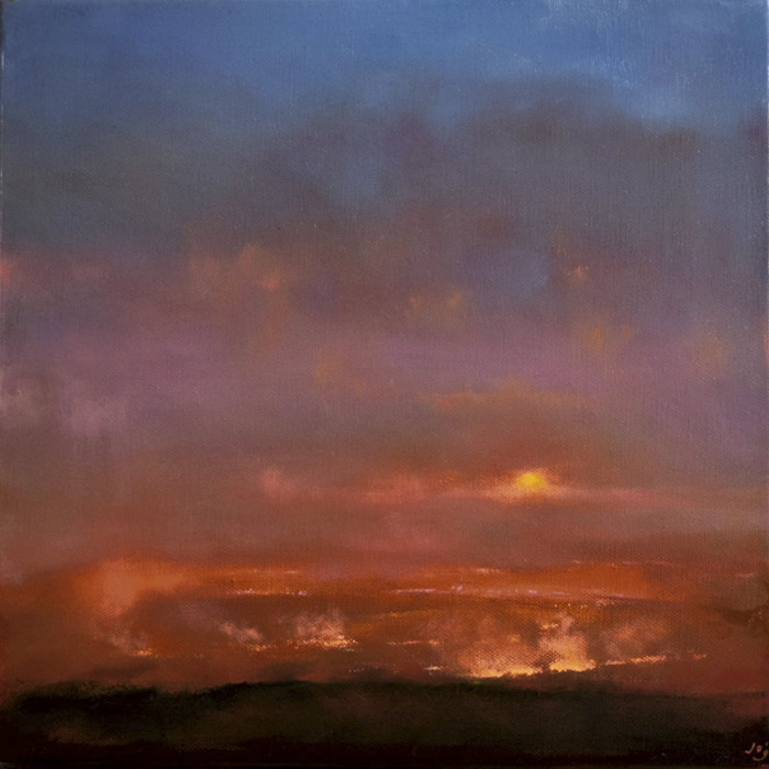
Flames in a Setting Sun II, ©John O’Grady
12″ x 12″ x 1.75″ Oil on deep edged canvas, does not require framing
SOLD
I often speak about memory and how a triggered emotion helps progress a painting. Often the driver is colour, how a mark or a tone responds to another one applied next to it. Does it sing? Does it sink? A colour arrangement can help trigger a memory and create the mood and atmosphere of a painting.
When making this piece, it was firstly about using a beautiful burnt orange. I spent the next few days trying in vain to find an arrangement of colours that could work with it. The resulting pale violet, pink, deep blue and umbers brought out the subject matter by itself, reminding me of times when I had seen gorse fires burning.
Across many parts of Ireland, fires are set to clear the land of gorse covering hillsides. The tinder-like bushes spread the fire; plumes of smoke are sent skyward and hang in a veil above the earth. In this instance, the setting sun glows with an eerie pale yellow, its rays numbed by the smoke.
From the land, the deep orange glow of the burning bushes illuminates the smog hanging in the evening air.
Just like the seasons, themes in the paintings I make follow a cycle and reoccur. Purely by coincidence, I painted the first ‘Flames in a Setting Sun’ just over a year ago.
Even though the subject matter is the same, the mood and execution are different. The first one is brighter with a closer view whilst today’s painting uses colour more subtly and with a more diffuse, smoke-filled feel.
I’d love to hear what you think.
John that is spectacular…lights my fire!!! LOL!!! AND it’s already sold…holy cow, that was fast!! Anyway, I’d re-title it…”Impressions on Dante”…. keep up the great work!!!
Hello Terry,
Thank you, your comment, it made me smile :). From the Inferno to the Doors in one sentence fabulous.
Hello John, I loved last years ‘Flames in a Setting Sun’ and I love this one too – soft and smokey and apocalyptic. Fantastic! Many congratulations – wonderful colour.
Hello Christine,
Thanks for your comment, yes it has a softer, diffused feel than the first one. I think the previous piece was more about description whereas this one is more about the atmosphere that colour can evoke.
This has a strangely apocalyptic tone, John, that is appealing to me. Awesome and fearsome somehow. Sublime in that sense of the word — that destruction can create such otherworldly beauty. It has set me to thinking about why this tugs at me so.
I also meant to comment on how successful your color work is here. Any color is defined (in part) and altered by the colors around it. I’m sure that achieving a balance between somewhat jarring contrasts and harmony, warm and cool, in this painting was no small feat! The sun peering out from a scrim of smoke is a striking focal point.
Hello Jo,
Thank you for your comment, after quite a struggle, the colour came right and it ended up resolved I think, particularly the ‘scrim’ over the sun.
The apocalyptic tone you mentioned does seem fitting, although softer and more diffuse than the first one. I do think this one is much darker and uncertain about what we are beholding, it might be because it is less descriptive. Great to hear that it has such an emotional connection with you.
Spectacular is the word that came to me, too, John. I love this painting and love the way you let yourself play with color, space, painting style–all very evocative. I was so close to pressing the buy button! Now someone’s beat me to it. Congratulations!
‘Hello Rachel,
Thank you for your comment and thoughts on the painting. I am glad to hear that it connected with you. It was a trial resolving the colour arrangement but was worth the effort as I learnt a fair bit in the process. Art is a verb I think and only by the doing do we move forward, although often it feels like one step forward two steps back or even sideways’.